For a while I’ve had an interest in vintage typefaces. This interest stems from my efforts to reproduce vintage literature and the logos.
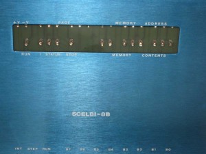
When I made my SCELBI front panels, one of the challenges I had, was to match the font for the SCELBI logo. Here is an image of the overall front panel.

SCELBI front panel
and a close up of the logo.

Scelbi logo- close up
Even though this is a variant of the omnipresent Helvetica, finding a digital font to match was harder than you think. After searching through dozens of variations of Helvetica and derivative fonts, in the end, I choose to use the very similar Helvetica Black. In some cases in the past, I have used Adobe Illustrator to manually recreate logos and such, but recreating characters accurately is extremely difficult and it is vastly easier to use off the shelf fonts.

Scelbi Logo in Helvetica black font
It’s a pretty close match, but in reality the original logo’s characters are just a bit wider, so it’s not perfect.
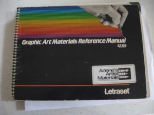
I’ve known for a while that the single largest source of typefaces for printers and advertising people back in those days was Letraset brand rub on transfers. Back in the day, anyone that had anything to do with the printed word, would have had a Letraset reference manual, which contains hundreds of fonts and other visual goodies. Vintage Letraset manuals are available from used book sellers and even on ebay. Recently I picked up a 1981 edition.

Letraset Reference
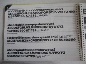
One the first things I did when I got this guide was to determine if I could find an exact match for the SCELBI front panel logo. Here is what I found on the page with bold type Helvetica fonts.

Letraset Helvetica Bold
If you ask me, plain old Letraset Helvetica Bold is an exact match and was the source for the lettering on the original panels. Now I’m just going to have to figure out the best way to digitize and scale the example letters found in the Letraset guide for my next batch of front panels.

