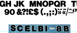
In a previous post I commented that the Helvitica Bold was an exact match for the SCELBI-8B panel logo.
Well I went to digitize a recreation of the logo for eventual silk screening on a front panel and I found that I was mistaken. The panel characters are wider than the Lettraset letters and I couldn’t find a better match in the Lettraset catalog. Helvetica Bold was the closest that I could find, but as you can see, it’s too narrow.
These characters were scanned from the Lettraset book, scaled and placed over the top of the original lettering in Photoshop.
However, I was able to resolve the issue by stretching the scanned Lettraset letters horizontally, one at a time, in Photoshop.
I think the result is about as nice a match as you could hope to have.

